Who is the most interacting in your network?
Show me who it is
Gender Recognition
Our LinkedIn Gender trained model identify the correct gender in more than 90% of all cases.
Learn More
Identify your ICP
Our ICP trained model is daily revewing your interactions, likes, comments, connections and behaviour on LinkedIn.
Learn MoreWhat We Do?
We match you with the right people on LinkedIn, tailored on your specific requirements.
Our models track, review and handle million of LinkedIn datapoints every single day, to ensure you interact correctly and progressively on LinkedIn. Our different Agents identify how you can become top 1% of all LinkedIn users, and is daily suggesting new things you shuold act on and provides you with a concrete response.
More Details about our Agents0
People identified
0
Interactions ensured
0
Posts published through LinkedAlibi
0
% increased reach for our users
Join Our Community
Our software is completely free to use for personal usage, while we charge companies for their shared Interaction and ICP Models.
We trust LinkedIn is the right place be. We want to ensure as many people feel safe and confident to interact on LinkedIn and reach the many opportunities within their worldwide community.
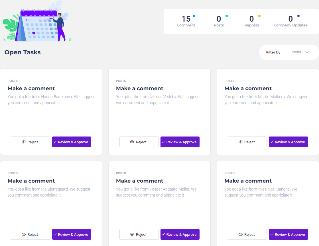
Keep Control
We suggest Tasks, you approve them.
Our 5 Agents is always screening your LinkedIn profile to identify the next Task you should perform to stay on top.
Youwill then get presented of the suggestion, you review it and change it or can just approve it straight away.
- You control what is written
- It can be done within minutes
- It is published in a running sequence, not instantly
- You stay personal, and do not sound like an robot

Why Choose Us?
Tired of using 5 different and expensive tools to keep track of your LinkedIn Profile?
Our service is as shown, we do not have any hidden extras or only provides you with half the resources we are telling you about.
We are sure you can pay thousand of dollars and find tools that is 5% better than us, but all other tools keep a massive workflow on your shoulders - while we make it easy as a game to win.
We are not another analytics tool. We combine the analytics with actual actions you should follow. By doing so, you not only get insights of your status - you also get real life actions to win the game.